UI DESIGN - The first steps
Once the UX design of a digital product has reached a stage where at least the major screens are close to the final version, it is time to start working on the UI design.
In general, there are three ways to start the UI design process:
- Based on a completely new concept. In this case, design start from the beginning: the colours, fonts and, where appropriate, the brand image around the product, with a special focus on the logo (such as the Riding Valley app).
- Based on an existing brand. For an existing company, development is aided by a company brand book of a series of guidelines. In this case, deviation from the official guidelines is not possible. UI design must follow the same buttons for the input fields, abide by the set rules, and use identical fonts and colours, just to mention a few. In most cases, this is useful and makes the design process easier: the developer team members don't have to build the UI Library themselves and can use the material available to mix ready-made screens, just like in the case of Lego. The downside of this version is that as soon as the designers face a solution in the UX plans for which there is no clear solution in the guide, it is harder to find a way to make sure it fits into the brand's ruleset. (e.g. typically banks, insurance companies, telcos)
- Sometimes as a hybrid of the first two, designers need to consider basic principles, but these are exhausted in corporate colours and fonts. One can argue this is a limiting factor, others might say it is a small help.
How to get started?
In cases 2 and 3, clearly by looking at the original guide. It is important to understand when and how to use it. If we're lucky, we'll get a ready-made UI Kit that works in the design program we're using (e.g. Figma), and then comes the ‘legwork’. If we're less lucky, we typically must pick out what's relevant to us from a PDF document of many pages and build our element kit based on that.
What's more interesting is case 1. Without official guidelines, UI design must work closely with Marketing to determine a design framework. In this case, we look at the area of the product, the industry, and the substitute products to determine the ideal colours and fonts. It is worth thinking about periods too, as certain colours might lose their attractiveness as time goes by. The industry is key because in some cases it is beneficial to use recognisable patterns, and sometimes it is better to create something very original. Think about the differences when you enter the taxi or the social media industries.
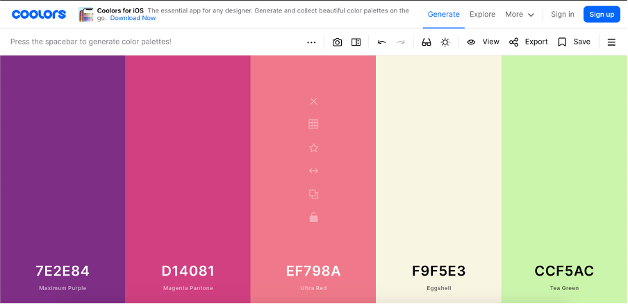
There are plenty of online tools to help you choose the right colour. The ideal option is Coolors, where you can mix and match random colours and then choose additional complementary colours by fixing some colours. If you don't have time to do this, there are endless combinations of colours saved by others on the site, just make sure you choose.

It has become increasingly common to have two versions of the same app, whether developed for mobile or desktop. These are typical 'light' and 'dark' versions. More recently, operating systems themselves have started to support them, so you just need to set the system to whichever version you prefer, and the installed applications will appear in that version. If there is a need for this in our project, it will require double attention to colour. It's important that the overall effect is similar in both cases and that everything is easily recognisable whichever version we choose.
When choosing a font, it is also worth following this approach. For an online fashion store, you might use display fonts, while for an app for children, handwritten fonts might be ideal. If you're designing a dashboard interface or a system with tables that display a lot of data, you may want to use narrow fonts that are easy to read.
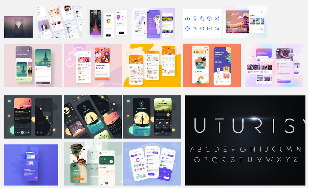
As a designer, you look a lot at other people's work on Dribbble or Behance, so you're always up to date with trends. Usually, you can't just put on a trendy robe and call it a day, and there's something in you that makes you want to create something unique rather than just "copy". The best solution is to create a mood board. This step 0.

Once you have established your work and you have all the basics figured out, you can start to build the tiny mosaic pieces that will later form the final design in an exciting process. In the next section, I will show you how this process works.
Zoltán Kurucz
UX/UI Designer
SynerinSoft


